Printable Room Decor Checklist: Plan, Shop, Finish Fast
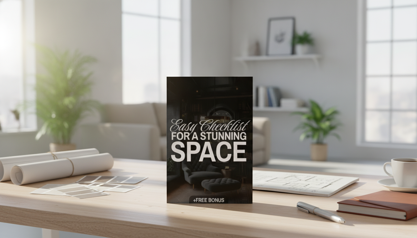
Easy Checklist for a Stunning Space: A Step-by-Step Digital Decor Plan You Can Print
A beautiful room is usually the result of clear decisions made in the right order—function first, then layout, then style, then finishing touches. This guide breaks the process into a practical checklist that works for a full room refresh or a small weekend reset, with a digital plan you can print and reuse whenever a space starts to feel cluttered or unfinished.
Start With the Room’s Job (So Every Choice Has a Purpose)
Before colors, pillows, or wall art, decide what the room is truly for. When the “job” is clear, it’s easier to say no to items that look nice but don’t help you live better.
- Define the primary function: lounging, working, entertaining, sleeping, storage-heavy, kid-friendly, or multi-use.
- List the top 3 activities that happen in the room and what currently gets in the way (glare, clutter, poor traffic flow, not enough seating).
- Set 2–3 non-negotiables: “clear walkway,” “hidden charging,” “easy-to-clean textiles,” or “space for guests.”
- Choose a feeling to guide decisions: calm, bright, cozy, modern, playful, or classic.
- Decide what stays: anchor items worth building around (sofa, bed, dining table, heirloom piece).
If you want a ready-to-print plan that keeps decisions in the right order, the Easy Checklist for a Stunning Space | Digital Home Decor Design Ideas Guide & Printable Organization Tool helps you move from “ideas” to “done” without losing momentum.
Measure, Map, and Fix the Flow Before Buying Anything
Most decorating regret comes from skipping measurements. Five minutes with a tape measure can save weeks of returns and “almost works” furniture.
- Measure wall lengths, ceiling height, window/door locations, and outlet placements; note vents and radiators.
- Mark traffic paths: aim for comfortable walkways and avoid blocking door swings.
- Place the biggest items first: confirm the layout supports the room’s job and doesn’t create “dead corners.”
- Use a quick zoning plan for multi-use rooms: “work zone + relaxation zone” or “play zone + storage wall.”
- Reserve at least one open area (visual breathing room) to prevent the space from feeling busy.
Tip: when you’re torn between two layouts, choose the one that protects the clearest path from the doorway to the main destination (sofa, bed, desk). A room that’s easy to walk through automatically feels more polished.
Choose a Simple Style Direction (Without Overthinking It)
A “style direction” isn’t a label—it’s a short set of guardrails so the room reads as one story instead of a bunch of random chapters.
- Collect 8–12 reference images and look for repeated cues: wood tone, metal finish, contrast level, shape language (rounded vs. sharp).
- Pick a “base” and a “spark”: base is neutral and timeless; spark is a color or pattern used in small doses.
- Limit finishes to a tight set: typically 1–2 wood tones and 1–2 metals to keep the room cohesive.
- Match patterns by scale: pair one large-scale pattern with one small-scale pattern rather than multiple competing prints.
- Plan for aging and maintenance: choose materials that fit the household (pets, kids, high-traffic).
Build a Cohesive Color Plan in 10 Minutes
A fast color plan is simply a repeatable formula. If you want a deeper dive into classic combinations, Architectural Digest’s overview of color schemes can help you spot what feels balanced.
Paint is especially sensitive to lighting. For practical guidance on sampling and undertones, see Sherwin-Williams’ interior paint and color guidance.
A Practical Shopping Checklist (What to Prioritize First)
Quick Room Refresh Checklist (Print-Friendly)
| Step | What to Decide | Done |
|---|---|---|
| 1 | Room function + 3 pain points | ☐ |
| 2 | Measurements + layout plan | ☐ |
| 3 | Style cues + finish limits | ☐ |
| 4 | Color plan (dominant/secondary/accent) | ☐ |
| 5 | Lighting layers (ambient/task/accent) | ☐ |
| 6 | Textiles (rug/curtains/bedding/throws) | ☐ |
| 7 | Storage plan (open vs. closed) | ☐ |
| 8 | Wall decor (art, mirror, shelves) | ☐ |
| 9 | Finishing touches (plants, scent, styling) | ☐ |
| 10 | One-week adjustment notes | ☐ |
Lighting That Makes Everything Look More Expensive
Great lighting is the shortcut to making even simple furniture feel intentional. It also helps color look accurate—especially with higher-CRI bulbs. For an easy explainer, see the U.S. Department of Energy’s notes on lighting choices and CRI.
If your room needs an instant focal point plus atmosphere, a sleek feature like the 60-Inch Wall-Mounted Electric Fireplace Heater with App Control & Remote can add “finished” energy to a main wall (especially when paired with balanced lighting on both sides).
Styling That Looks Intentional (Not Cluttered)
Keep It Easy: A Repeatable Weekly Reset Routine
Printable Digital Tool: Turn Ideas Into a Finished Room Faster
To keep your plan organized from the first measurement to the final styling pass, use the Easy Checklist for a Stunning Space | Digital Home Decor Design Ideas Guide & Printable Organization Tool as a reusable “decor roadmap” you can print anytime a space starts to drift.
FAQ
What should be chosen first when redecorating a room?
Start with the room’s function and layout (measurements, traffic flow, and large furniture placement). Once the layout works, confirm your style cues and color plan, then shop for decor and finishing touches.
How can a room look cohesive without matching everything?
Limit your wood tones and metal finishes, repeat one accent color several times around the room, and keep a consistent contrast level (light/airy or dark/moody) across major pieces.
What’s the fastest way to make a space feel more finished?
Improve lighting layers, hang curtains higher and wider, use the correct rug size, and add one strong focal wall element (like large art or a mirror) to anchor the room.











Leave a comment