Iron Chandelier Living Room Guide: Size, Height & Warmth
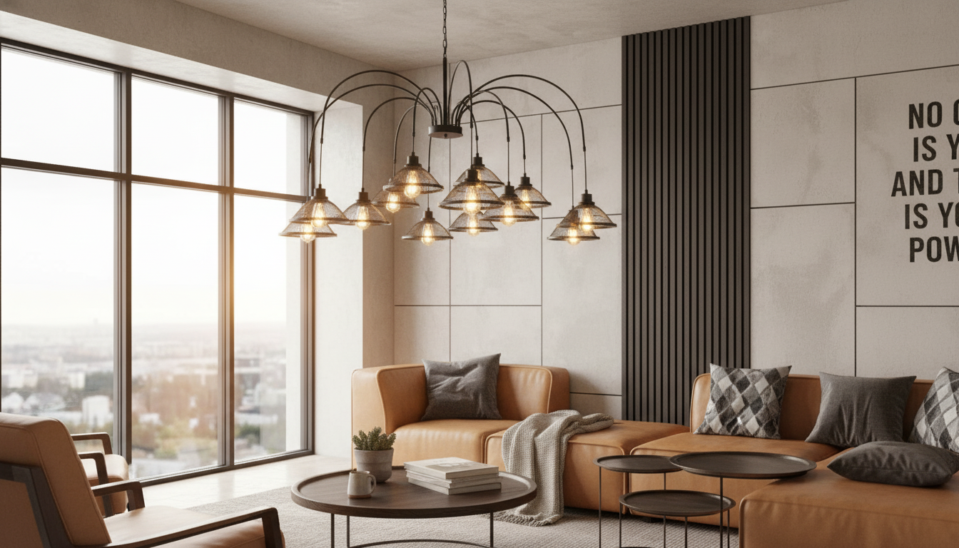
A vintage industrial chandelier in minimalist iron brings structure, warmth, and visual balance to a living room—especially in open-plan spaces where lighting doubles as décor. The right fixture can define a seating zone, add a confident focal point overhead, and make everyday lighting feel more intentional. Below are practical ways to place, size, style, and install an iron chandelier so it looks proportional and performs comfortably day to day.
What Makes This Chandelier Style Work in a Living Room
Minimalist iron chandeliers succeed because they deliver “architecture” without clutter. Clean lines keep the silhouette crisp, so the fixture feels like part of the room’s framework rather than extra decoration.
- Clean iron lines keep the look uncluttered while still adding architectural presence overhead.
- Industrial-inspired forms pair well with modern, rustic, loft, and transitional interiors without feeling theme-heavy.
- Iron finishes tend to hide fingerprints and everyday wear better than high-gloss metals, which is helpful in high-traffic spaces.
- A chandelier can visually anchor a seating group, especially when rugs and coffee tables are lower, flatter elements.
In many living rooms, a chandelier becomes the “third dimension” of the layout: it helps the eye travel upward, which can make a space feel finished even when the furniture profile stays low and minimal.
Placement Ideas That Feel Balanced
Placement is less about centering in the room and more about centering over the way the room is used. Aim to align the chandelier with the primary seating experience rather than the four walls.
- Center over the main seating zone: align with the midpoint of the sofa/sectional and coffee table to create a cohesive focal point.
- Float over a conversation area: in larger rooms, position above the primary seating cluster rather than dead-center in the whole room.
- Layer with ambient light: pair the chandelier with wall sconces or floor lamps so nights feel cozy instead of “overhead-only.”
- Mind sightlines: avoid hanging directly between the TV and seating where glare and visual obstruction can occur.
Quick Placement & Clearance Guide
| Scenario | Recommended Clearance | Notes |
|---|---|---|
| Standard living room (walk-under areas) | Bottom of fixture ~7 ft (213 cm) from floor | Increase height if tall family members or frequent traffic |
| Over a coffee table (not a main walkway) | Bottom ~30–36 in (76–91 cm) above tabletop | Keeps the light intimate without blocking views |
| Sloped ceiling | Use a compatible canopy or adjustable mounting | Confirm the chandelier is rated for angled installation if needed |
| Ceiling fan nearby | Keep clear spacing between blades and fixture | Prevents strobing shadows and improves airflow |
Choosing the Right Size for the Room
Scale is what makes an iron chandelier look intentional rather than “added later.” Start with room proportions, then refine based on ceiling height and visual weight.
- Use room proportions as a starting point: larger living rooms typically need a wider chandelier or a multi-light design to avoid looking underscaled.
- Consider visual weight: darker iron finishes read heavier; slimmer frames can suit smaller spaces while still giving an industrial edge.
- Account for ceiling height: higher ceilings can handle longer drops, while standard ceilings often look best with a tighter silhouette and shorter downrod/chain.
- Confirm canopy coverage: if replacing an older fixture, ensure the new canopy hides any ceiling marks from the previous base.
A simple way to sanity-check: if your sofa and rug create a strong rectangle, the chandelier should feel like it “belongs” to that rectangle—not like a tiny dot drifting above it. When in doubt, prioritize a bit more width over extra drop, especially in rooms with standard-height ceilings.
Bulbs, Brightness, and Color Temperature
Bulbs determine whether an industrial chandelier feels welcoming or stark. Iron frames look best when the light reads warm and comfortable rather than clinical.
- Aim warm: 2700K–3000K usually complements iron finishes and soft furnishings in living rooms.
- Go dimmable: dimmable bulbs let you shift from bright daytime use to relaxed evening lighting without changing fixtures.
- Match bulb shape to the frame: exposed-bulb designs often look best with Edison-style profiles or clear glass (choose LED versions for efficiency).
- Check compatibility: confirm base type and maximum wattage rating; LEDs reduce heat and energy use.
For efficient lighting guidance and LED performance basics, see ENERGY STAR lighting resources and the U.S. Department of Energy overview of LED lighting.
Styling Tips: Minimalist Without Feeling Cold
Iron can read bold, so the key is to balance it with texture and a calm palette. The result is minimalist, but still livable.
If the room needs a refined color plan to soften the industrial edge, Colorful Quiet Luxury Palettes Checklist can help coordinate neutrals and accent hues so the metalwork looks intentional rather than heavy.
Installation and Safety Considerations
For a general electrical safety overview, refer to InterNACHI’s guidance here: Electrical Safety Overview.
Featured Option for an Industrial-Minimal Living Room
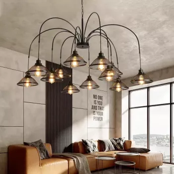
For a streamlined statement with vintage character, the Vintage Industrial Minimalist Iron Chandelier for Living Room is designed to add structure overhead without visually overwhelming the space.
FAQ
How high should a chandelier hang in a living room?
In walkways, a common guideline is to keep the bottom of the chandelier about 7 feet from the floor. Over a coffee table (where people aren’t walking under it), it can hang lower—often around 30–36 inches above the tabletop—adjusted for sightlines and traffic flow.
What color temperature looks best with an iron chandelier?
Most living rooms look best with warm light in the 2700K–3000K range, which complements iron and keeps the space inviting. Dimmable LEDs make it easy to shift from brighter task lighting to softer evening ambiance, while cooler temperatures can feel stark with industrial finishes.
Do iron chandeliers work with modern minimalist décor?
Yes—simple iron frames and neutral finishes can enhance minimalist rooms by adding clean structure overhead. Keep other statement pieces limited and repeat the metal finish subtly so the chandelier feels integrated rather than attention-seeking.











Leave a comment