Quiet Luxury Color Palette Checklist (Muted, Timeless)
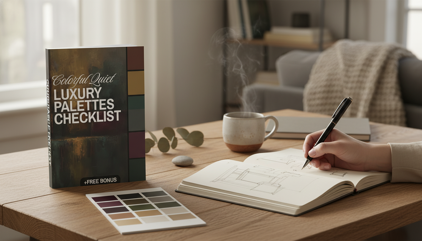
Colorful Quiet Luxury Palettes Checklist: Elegant Color Schemes for Minimalist, Timeless Spaces
Quiet luxury doesn’t have to mean beige-on-beige. With the right palette, color can feel calm, refined, and enduring—never loud or trend-chasing. The difference comes down to restraint: balanced neutrals, controlled saturation, and small, deliberate contrasts that read as effortless in rooms, wardrobes, and brand visuals.
If you want a streamlined system you can reuse, the Colorful Quiet Luxury Palettes Checklist (digital download) is designed to help you choose tones with clear proportion rules, repetition prompts, and “edit” steps so your final palette looks intentional.
What “Colorful Quiet Luxury” Looks Like in Practice
- Color is present, but controlled: soft-to-medium saturation and plenty of breathing room.
- Neutrals do the heavy lifting (stone, oat, ink, cocoa), while color plays a supporting role.
- Contrast is intentional and usually low-to-moderate (fewer hard black/white jumps).
- Materials and finishes matter as much as hue (matte walls, brushed metals, natural fibers).
- Repeating a small set of tones across elements creates an “edited” look.
Quiet Luxury Color Principles at a Glance
| Principle | How it shows up | Easy check |
|---|---|---|
| Anchored neutrals | Warm or cool base tones across most surfaces | At least 60% of the palette is neutral |
| Restrained saturation | Muted color or softened brights | No more than 1 high-chroma accent |
| Soft contrast | Tonal layering rather than stark edges | Squint test: elements blend, then separate |
| Repeat & echo | Same hue appears in 2–4 places | Accent color repeats at least twice |
| Texture-forward | Natural materials add depth without extra color | Two+ tactile finishes per space/outfit |
Checklist: Build an Elegant Color Scheme (Room, Wardrobe, or Brand)
- Pick a temperature direction: predominantly warm (cream, camel, terracotta) or cool (stone, slate, ink).
- Choose 1 primary neutral and 1 secondary neutral (lighter/darker) to create depth.
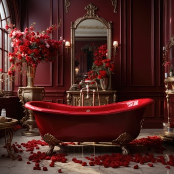
- Add 1 muted color as the signature tone (sage, dusty rose, mineral blue, olive, aubergine).
- Add 1 optional accent for definition (brass, oxblood, deep teal, espresso, graphite).
- Set a proportion rule: 70/20/10 or 60/30/10 depending on how “colorful” it should feel.
- Plan repetition: place the signature tone in at least two zones (textile + art, knit + bag, header + buttons).
- Confirm harmony using undertones: keep reds/oranges together or blues/greens together unless intentionally contrasting.
- Decide the finish strategy: matte for calm, satin for quiet highlight, glossy only in small accents.
- Do a lighting check: daylight vs evening bulbs can shift warm/cool balance dramatically.
- Finalize with a “remove one” edit: if a color doesn’t repeat or support the neutral base, cut it.
For digital design and brand systems, it helps to separate “style contrast” from “readability contrast.” Keep your aesthetic contrast soft, but verify functional contrast for text and buttons using established guidance like the W3C Accessibility Guidelines (WCAG).
Signature Palette Families (Colorful, Minimal, Timeless)
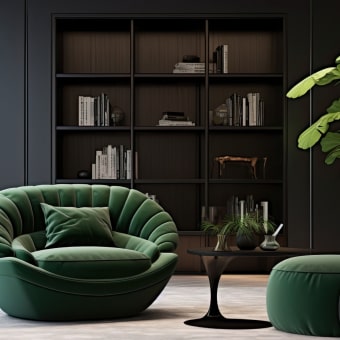
- Mineral Calm: stone + misty blue + brushed silver + charcoal details
- Olive Atelier: oat + olive + warm white + antique brass
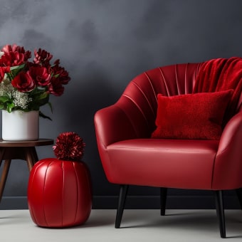
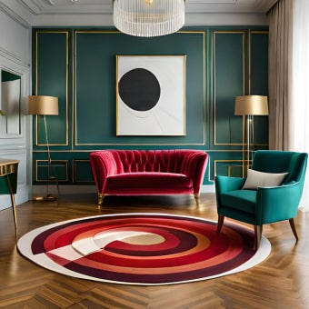
- Rosewood Modern: greige + dusty rose + cocoa + soft black
- Coastal Ink: sand + ink navy + cloud white + weathered wood
- Gallery Neutral with a Twist: warm white + putty + muted saffron + espresso
Palette Families and Where They Shine
| Palette family | Best for | Accent to keep it refined |
|---|---|---|
| Mineral Calm | Bedrooms, bathrooms, workwear basics | Charcoal or graphite |
| Olive Atelier | Living rooms, capsule wardrobes, packaging | Antique brass |
| Rosewood Modern | Dining spaces, evening outfits, boutique branding | Soft black (not jet) |
| Coastal Ink | Entryways, offices, denim-forward wardrobes | Weathered wood tones |
| Gallery Neutral + Twist | Studios, minimalist homes, editorial layouts | Espresso brown |
To keep palettes consistent from screen to print (especially for packaging and brand work), it’s useful to reference standardized color systems and guides like Pantone. And if you want a quick refresher on the building blocks—hue, saturation, and brightness—Britannica’s overview of color fundamentals helps frame why “muted” reads as calmer.
Common Mistakes That Make “Luxury Color” Feel Loud
Digital Checklist Download: When a Ready-to-Use Palette System Helps
Two simple add-ons that make palettes feel more “finished”
- A defined lighting moment: warm, focused light makes muted color look richer instead of dull. Consider a sculptural accent like the Luminous Wooden LED Light Globe 3D Puzzle Model Kit to add glow without adding extra hues.
- A reusable system: keep your neutrals, signature muted tone, and accent rules in one place with the Colorful Quiet Luxury Palettes Checklist (digital download), especially when you’re coordinating across rooms, seasons, or brand layouts.
Who Benefits Most From a Palette Checklist
| Use case | Typical challenge | What the checklist clarifies |
|---|---|---|
| Home refresh | Rooms feel mismatched | Neutral base + controlled accent plan |
| Capsule wardrobe | Nothing “goes together” | Signature tones and repeat strategy |
| Brand visuals | Colors look trendy or inconsistent | Proportions, contrast level, and cohesion |
| Gift planning | Hard to choose tasteful colors | Safe, elegant palette families |
FAQ
How many colors should a quiet luxury palette include?
A reliable structure is 2 neutrals (one primary, one secondary) plus 1 signature muted color and 1 optional accent. Use a 70/20/10 or 60/30/10 proportion rule and repeat the signature tone at least twice so it reads intentional.
Can bright colors fit a quiet luxury look?
Yes—keep bright color to small areas, ground it with rich neutrals, and repeat it subtly so it feels curated rather than random. Matte finishes, textured fabrics, and darker anchors can also “soften” a bright into something calmer.
What’s the fastest way to stop a space or outfit from looking too busy?
Cut competing accents first, then increase the neutral coverage and commit to one signature tone that repeats. Swapping harsh pure black/white contrast for ink, charcoal, ivory, or bone often makes everything feel immediately quieter.


Leave a comment